How effective is the combination of the main product and ancillary texts?
Typography
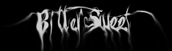
 For both the main product and the ancillary texts the title typography was consistent. We used the same font for the website, the end of the teaser trailer and the poster. (Title)
This keeps within part of the overall theme of all of the texts of a ‘smokey’ effect, which ties in with the birthday party, and the birthday cake with the candles smoking on the poster (Final Poster)- The typography of the titles in the teaser trailer and the tagline in the poster (Tagline) were the same font which was a block lettering this meant that it was consistent throughout. We chose to use a bright pink colour for the typography so that it carried on the running theme of a girl’s birthday party.
Party Theme.
- For both the poster and the website we used a picture of our antagonist holding a birthday cake, we also only lit one of the candles so that her face was partially lit however she was still easily recognizable (Poster Photoshoot). This meant that the focus was on the main protagonist and her girlish nature. Using a large picture of her staring right at the camera was also effective as it emphasised her creepy nature.
- From the mise en scene to the typography the girlish childlike party theme is consistent. Throughout the teaser trailer we focused on the mise en scene being bright, colourful and over the top especially with the ‘Birthday party’ scene (Birthday Party).

- For the poster we had a big birthday cake with multi coloured candles which emphasised the party theme. On the website we incorporated a party invite at the top of the website (Website Typography) we also had ‘RSVP’ typed next to all of our social networking hyperlinks. This shows the girls birthday party theme is spread throughout our main product and ancillary texts.
Horror Theme
- Although we had a ‘party theme’ throughout all three products, our genre is horror/slasher, which meant that those elements had to consistent throughout too.
- Grotesque elements were consistent throughout, as in trailer we filmed food which had live maggots covering it. (Mouldy Food)

For both the poster and the website we used the picture of our main antagonist holding a mouldy and old cake which enhanced the gruesome elements. - On our website we focused more on the party elements of our trailer with the party invite, so horror elements were not a main focus.
No comments:
Post a Comment